To comply with my non-disclosure agreement, I have omitted details and confidential information in this case study, including the name of the firm. The information in this case study is my own, not necessarily reflecting the views of the firm.
From September 2018 to September 2020, I worked with a large financial services firm as a CX Interaction Designer on the User Centered Design & Innovation team. I ideate on and create UI design & interactions, executing wireframes, prototypes, and design specs. My team on this project consisted of two designers and one researcher that are a part of UCD. Together, we worked with an Agile team comprised of developers, product owners, scrum master, QA, UAT, and tech leads. I collaborated with the team to help facilitate development and uphold the firm’s UX Styles & Standards. I also collaborated with product owners, stakeholders, users & subject matter experts, and fellow UX designers and researchers to better understand, ideate, design, test, and deliver solutions for our application features.
Providing more data for users helps them to better know and assist their clients in planning for the future. In order to accomplish this, the business asked me to lead the design to enhance an existing data table component to provide users with a multi-level data view on a single page. The additional data would utilize the same master data set so it made sense to enhance the existing table. Additionally, this enhancement would account for the digital collection of data that currently is only recorded on paper forms.
The challenge we faced is how to combine the multiple data sets in an effective way. I created a few sketches early in the project to help narrow down an approach.
- Tabbed Card
- Segmented Control
- Row-level popup initiated from the data table
- Individual row expand/collapse
- New card structure with a left-hand list of tabs and details popover
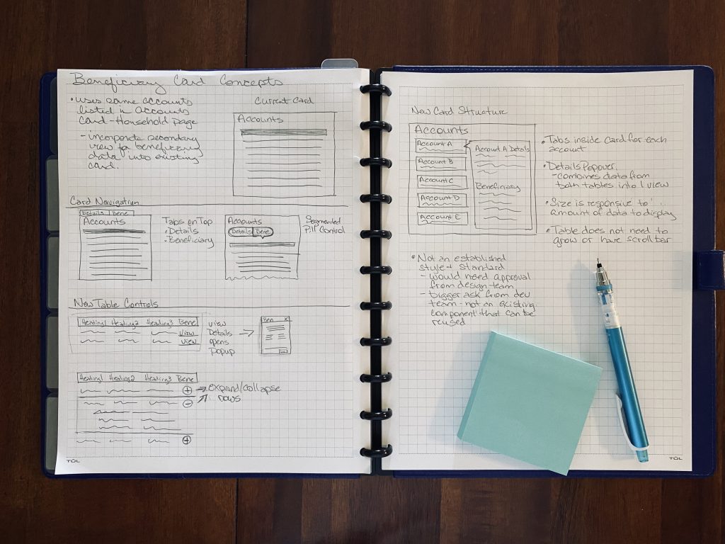
We decided to use a hybrid of the above concepts: the segmented control with the row expand/collapse. The team and I still had a lot of things we did not know about the data and what was beneficial to our user, but it was decided to maintain the list in the current table structure.
As the team and I learned more about the data, we also learned that depending on the type, some master list items in the data table do not include system-generated data. This information is not kept in a database and can only be found on paper forms. The forms are scanned in and kept in a digital file repository that is located in another system. It was important to provide a way for users to manually enter the missing data fields so an accurate comparison could be made for all rows in the table.
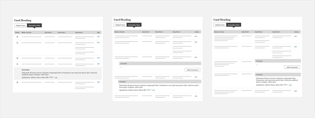
I decided to explore manually adding data as well as allowing for free form commenting. The team’s dedicated researcher conducted an email survey to find out what data was most important to users as well as determined what structure would be of greatest value. Through this research, the team and I learned that our users wanted to see as much data as possible, but were comfortable with some of the data being collapsed. They also thought it would be valuable to either add their own data or make comments.
Based on survey results and feedback from my product owners I updated the design to show all system-generated data and allowed for commenting when no data exists. This will make it very obvious to the user which data is system generated.
One of the biggest challenges of incorporating the multi-level table design into an existing component was that I had a limited amount of horizontal space to work within. Because of this, I proposed that we use to expand/collapse functionality on each row to hide or reveal a child row with additional data. It took several iterations to get the structure right.
Additionally, I had to convince my product owner that this was the right approach. He wasn’t on board with the expand/collapse functionality, he preferred to show the user all data at all times. But he also wasn’t happy with how cluttered the table looked when all data was shown. As the design improved with each iteration, he was able to see that expand/collapse was the best solution to adding more and more data to the existing component. And giving the user the choice to expand/collapse rows of their choosing allowed for a better comparison of master list items.
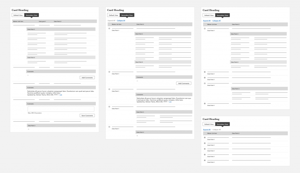
Middle: My new version of the table with expand and collapse controls.
Top Right: With the expand and collapse functionality, a user can choose which data rows they would like to drill down on to make a quick comparison.
Bottom Right: Table with all rows collapsed.
The new enhanced table I designed allows the business to provide users with multiple levels of data in the same place. Users no longer have to access a separate file repository to see all of the data points for master list items, which will help improve their workflow and adds value by allowing them to make side by side comparisons easily and quickly. This will help them to be more informed when working with clients.