To comply with my non-disclosure agreement, I have omitted details and confidential information in this case study, including the name of the firm. The information in this case study is my own, not necessarily reflecting the views of the firm.
Since September 2018, I have worked with a large financial services firm as a CX Interaction Designer as part of the User Centered Design & Innovation team. I ideate on and create UI design & interactions, executing wireframes, prototypes, and design specs.
Mid 2019, the Firm launched a rebranding effort that included updates to the logo, colors, and fonts. This effort would help better align the multiple lines of business to represent themselves as one unified company. Additionally, the new custom fonts would help the firm save money.
As a part of this rebrand, I assessed and defined brand updates to our Field and Team Member Platforms. This required me to explore broader impacts across these platforms to limit future tech and design debt and avoid user confusion. Along the way, I periodically checked in with fellow UX designers to gain buy-in for the modernization effort and to better understand their needs as they ideate, design, test, and deliver solutions for their designs and projects. As a result of my analysis, I made recommendations to update our style guide and demonstrated this point of view through modernized mock-ups of our current applications.
Initially, there were a lot of concerns from the design team surrounding the new Brand standards.
I was excited to start my exploration but recognized early that the new styles were somewhat limiting and could radically alter our current component library. Part of the challenge was only to apply the fonts and colors and not modify any other aspects of our components, including but not limited to button height and corner radius, navigation hierarchy, table structure, etc. In addition to this limitation, there were other challenges with the new styles:
- New fonts occupy more horizontal space. How will this affect our current UI?
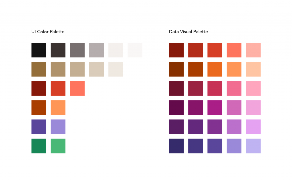
- The new color palette was limiting. We went from 262 colors in the current style guide to 46.
- Accessibility. Especially given the limited color palette, it was necessary to ensure that color limitations and challenges are accounting for accessibility.
- Proper consistency and cohesion. It was necessary to ensure that decisions create cohesion where appropriate with client-facing styles.
My initial analysis explored how the Client-facing applications team applied the new brand standards.
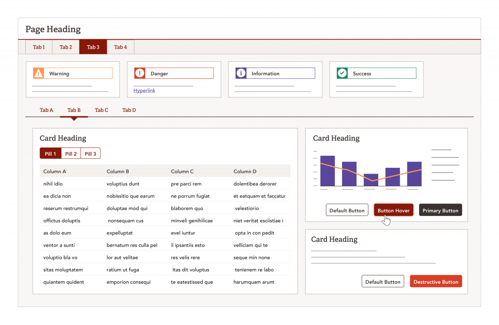
Examination of the client-facing styles and standards helped to identify a jumping-off point on a potential approach to apply the new colors. Ultimately, this was not the best solution for the Field and Team Member applications. The biggest impediment was the choice for actionable items: burgundy. I found burgundy created an overly red layout that was not only visually taxing, but it also competed with destructive buttons, errors, and important alerts and notifications.
Navigation and actionable items need to be different colors to create a more cohesive, balanced layout.
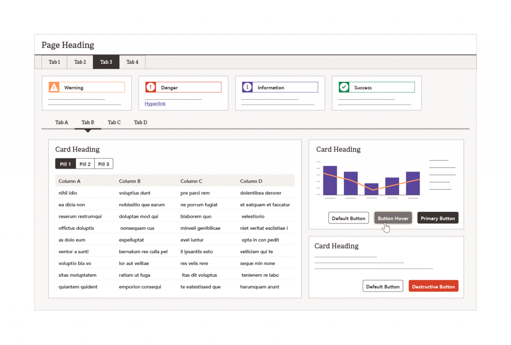
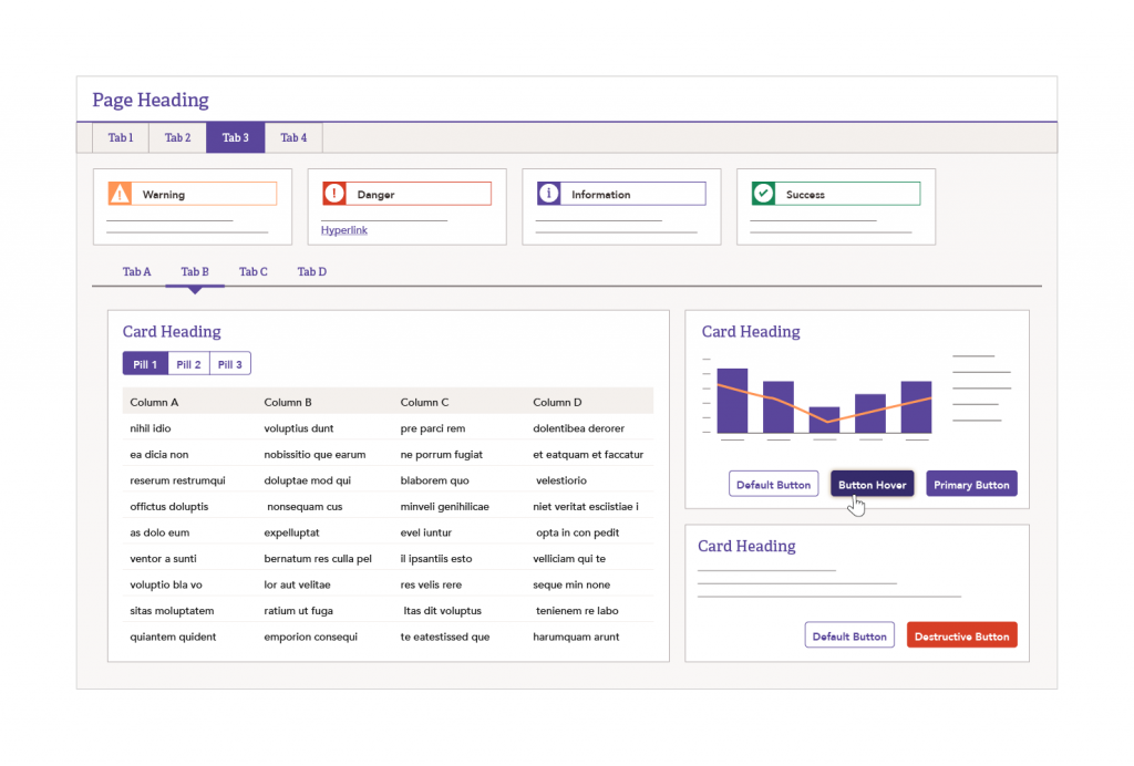
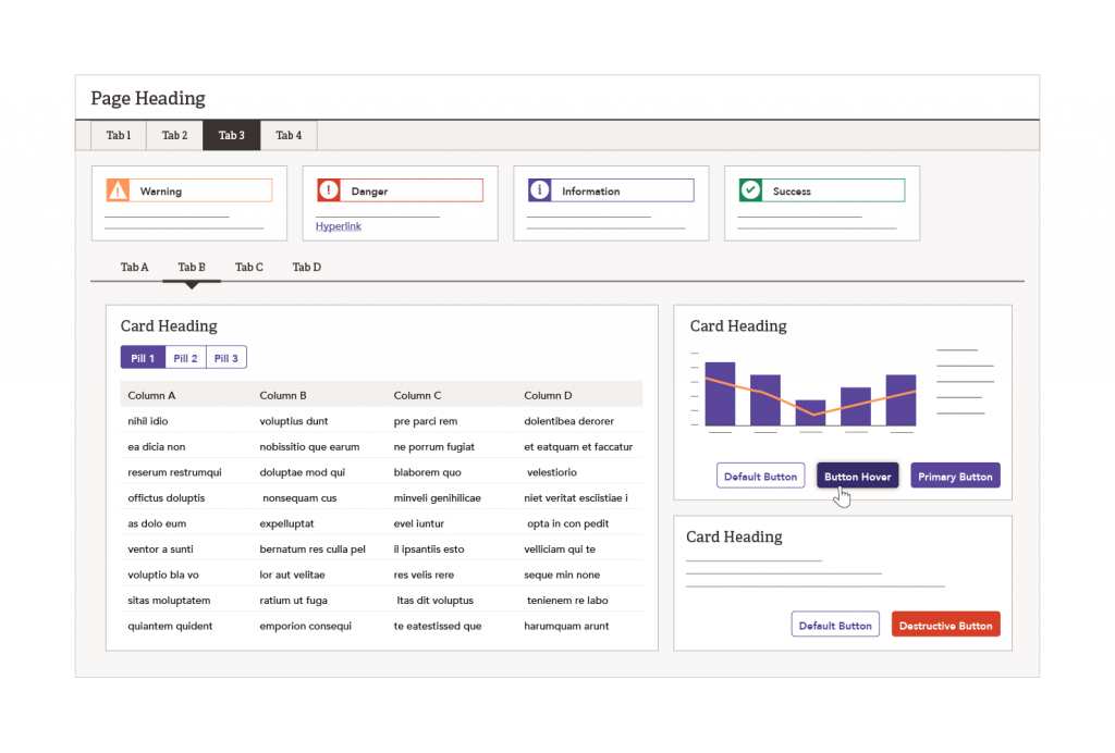

Regardless of which color I chose for the primary UI color, all options were overly dominant and visually taxing. Additionally, I was concerned that it would be harder to distinguish actionable items if everything on the screen was the same color. Utilizing two unique colors, one for navigation and a second for actionable items, created more visual balance. After exhausting several versions of different color combinations, I decided on a gray and gold color palette.
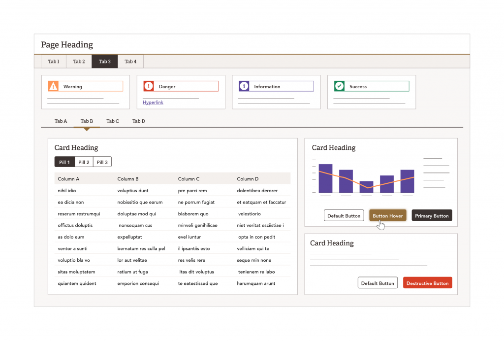
I was initially quite hesitant using gold. However, the Firm designated gold as the identifying color for my line of business. My hesitations stemmed from how to best represent gold as a flat color on a screen. In a print medium, the Firm had the benefit of being able to foil or emboss the gold to give it a more metallic look and feel. Additionally, it was the most unpredictable of all the new brand colors. When displayed digitally, the color gold can vary in appearance from dirty green to rusty brown, and anywhere in between. Since we can not control our user’s screen settings, I decided to implement a touch of gold. And of all the other colors I experimented with, gray was the most complimentary.
Brand modernization was the first project I worked on independently, and I am excited about all that I accomplished. While working on this project, I learned to holistically examine a design system and how even small changes can drastically affect the system on a molecular level.
There was initially a lot of concern from other designers about the new Brand standards. Through regular checkpoints with design leads, I was able better understand and empathize why they were hesitant to adopt the new standards. This collaboration also helped me to improve and ideate on my explorations. Ultimately, I was able to make a recommendation to the design team that I was not only proud of, but that the team was excited to adopt.